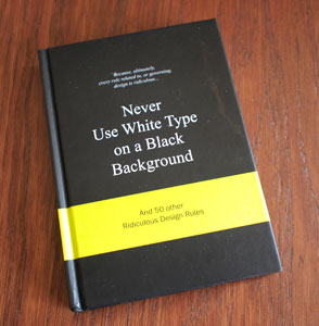
Never Use White Type on a Black Background
Posted on 2010-09-30 by Jan Vantomme
Tags:
typography
This little book takes you through 50 ridiculous design rules and ends with the advice to break these rules. Not the greatest piece of liturature, but a good book for light reading. The book is a collection of quotes made by designers, authors, creative thinkers, photographers, ...
Some "design rules" from the book
- Minimalism is dead
- If you don't know what to do... just do it big and red
- Cleavage or legs, never both
- Never use more than two typefaces
- [insert buzzword] is the new black
More Information
- ISBN13: 978-90-6369-207-0


