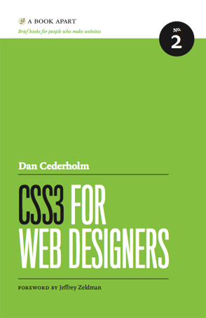
CSS3 for Web Designers
Posted on 2011-04-12 by Jan Vantomme
Tags:
css
CSS3 for Web Designers is a small book, it's only 189 pages. Or 222 pages if you use a slightly bigger font size. I'm not reviewing a 'real' book this time. I've read the 'enhanced' ePub version on the iPad. 'Enhanced ePub?' you might ask. Yes indeed. The book contains videos of some CSS3 interactions, so you can see what the code is all about. You'll be able to read the book in just a few hours.
An Overview
I'm going to take you through the book chapter by chapter so you'll get a good overview of the things you can expect.
Chapter 1: Using CSS3 Today
The first chapter gives some background on CSS3 and shows you why you can start using CSS3 in your projects today. When you target the experience layer, you can deliver better experiences to browsers that support new CSS3 features. Multiple background images, @border-radius@, @text-shadow@, @box-shadow@, @opacity@ and @RGBA@ are supported by most modern browsers, so you can start using them today.
Chapter 2: Understanding CSS Transitions
Transitions are the smallest building blocks to add a better user experience to your pages. They are used for smoothly animating changes in CSS values when a HTML element changes state. An example: animate the background color of a button in 0.3 seconds. You should go ahead and use these CSS transitions in your designs today, but remember to be subtle.
Chapter 3: Hover-Crafting with CSS3
In this chapter, you'll learn to build a navigation that will give a better experience to people with a modern browser, while people surfing with an older browser won't notice a thing. You'll learn how to use @opacity@, @text-shadow@, @border-radius@ and a nifty transparent PNG technique to create better user interactions.
Chapter 4: Transforming the Message
This book will only focus on 2D transitions. You'll learn how to use @scale@, @rotate@, @translate@ and @skew@ to transform pictures in an image gallery when a user interacts with them.
Chapter 5: Multiple Backgrounds
Dan shows you how to use multiple background images to create the parallax scrolling effect made famous by the "Silverback":http://silverbackapp.com/ website. And how to create a default style for browsers like IE7 and below that don't support them.
Chapter 6: Enriching Forms
This chapter goes through some useful techniques to style web forms. You'll learn how to use gradients to give form elements a 3D feeling, and to use @box-shadow@ to create better focus states.
Conclusion
Dan shows you how to use CSS3 in a comprehensible way. If you have some experience writing CSS, you'll get the hang of it real soon. I recommend this book to all my students.
More Information
- Author: Dan Cederholm
- Website: http://books.alistapart.com/products/css3-for-web-designers


